AHSYLA CREATIVE
Olympic Pictograms

- Client:
- Olympics
- Project Type:
- Student Project – Graphic Symbolism
- Software:
- Adobe Illustrator & Photoshop
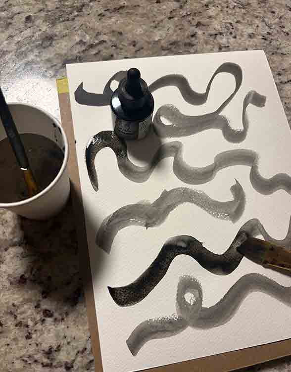
THE EXPLORATION
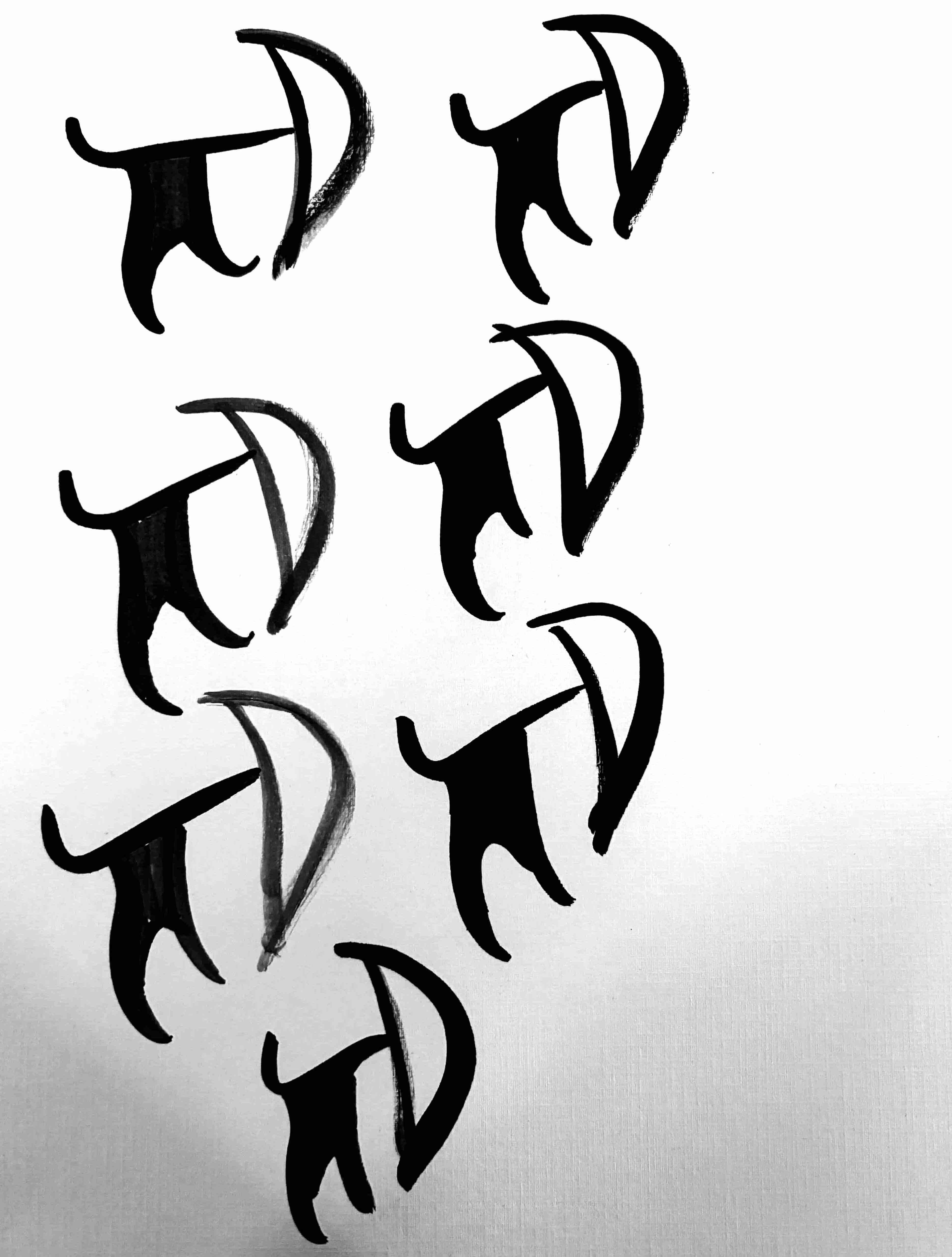
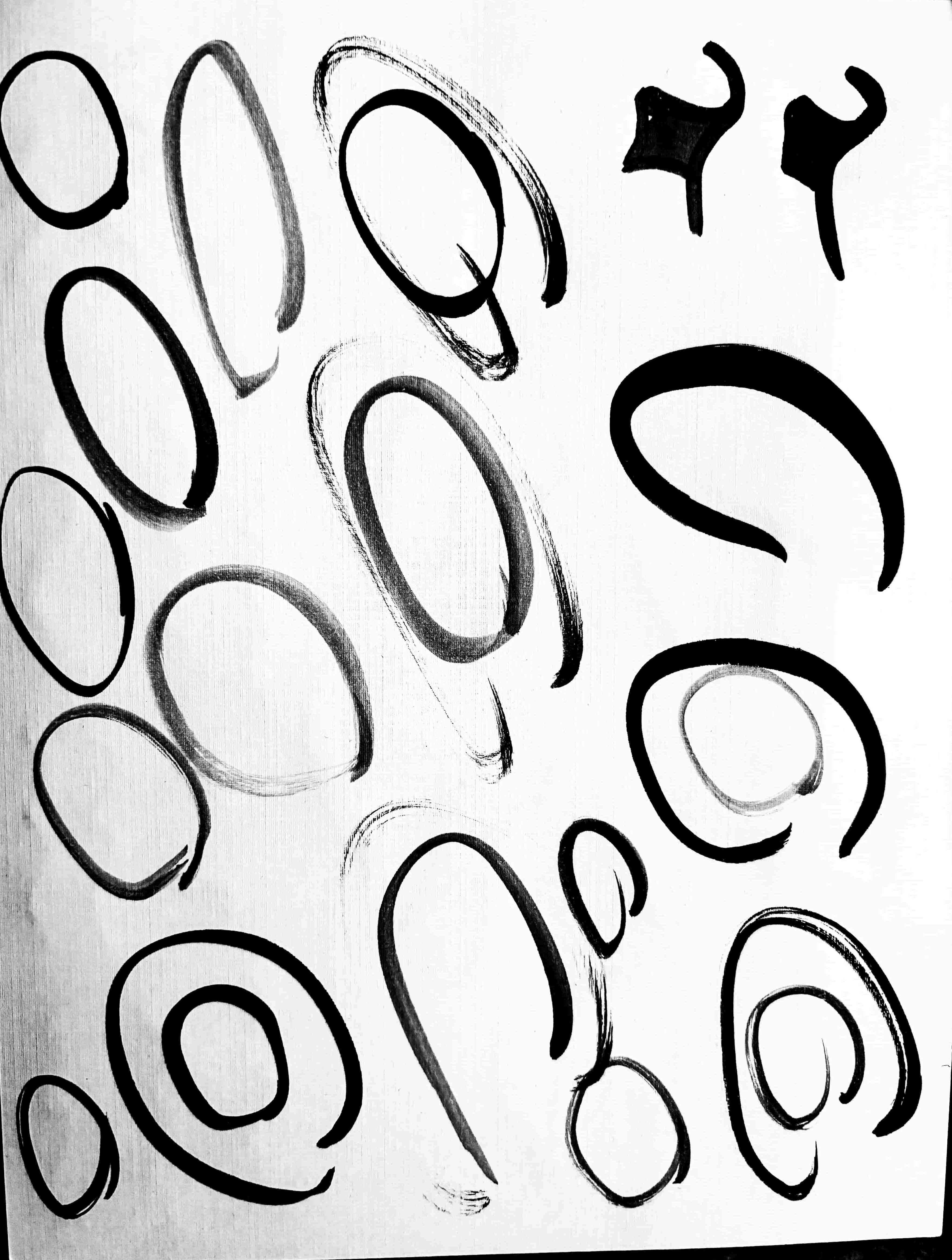
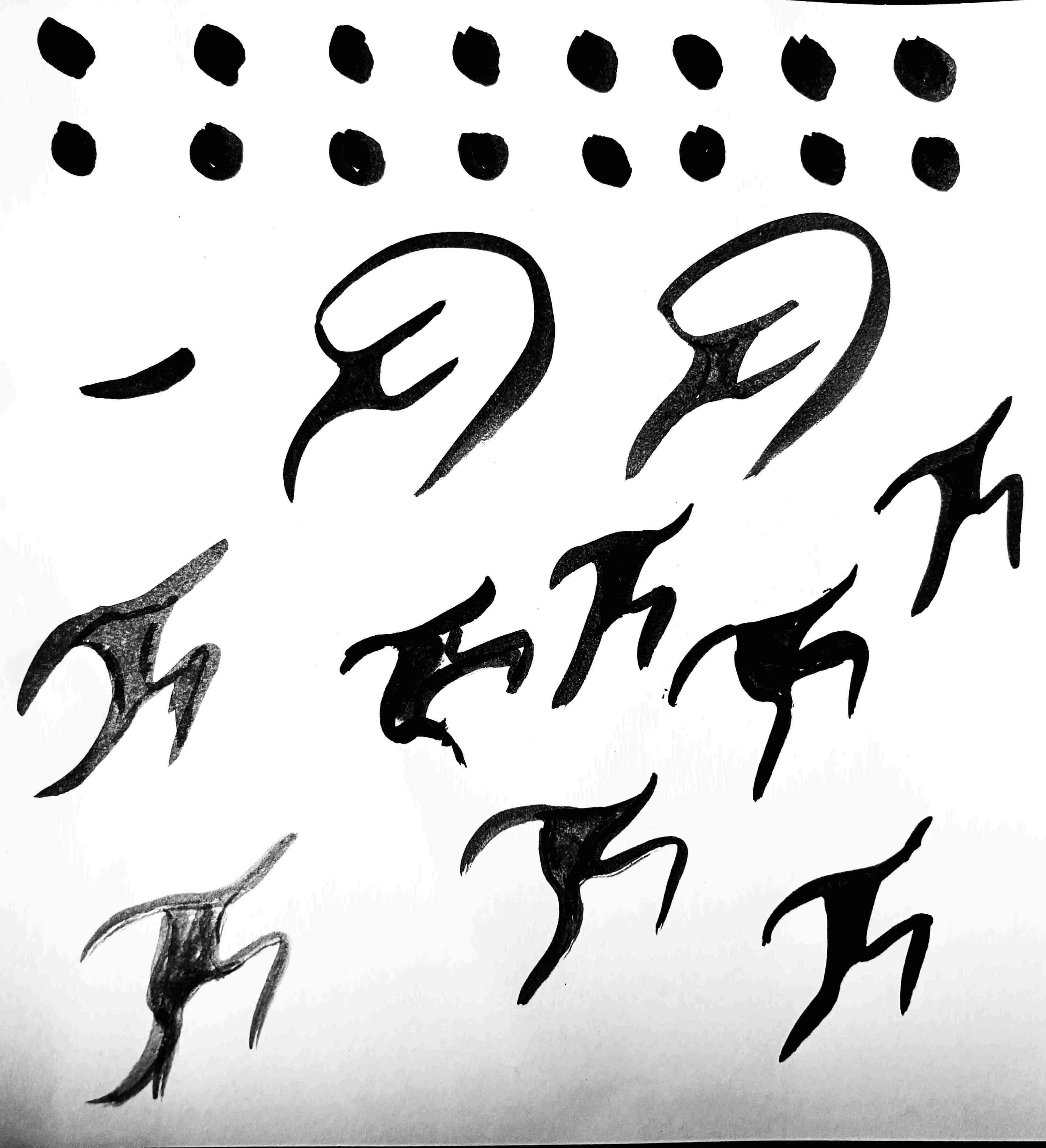
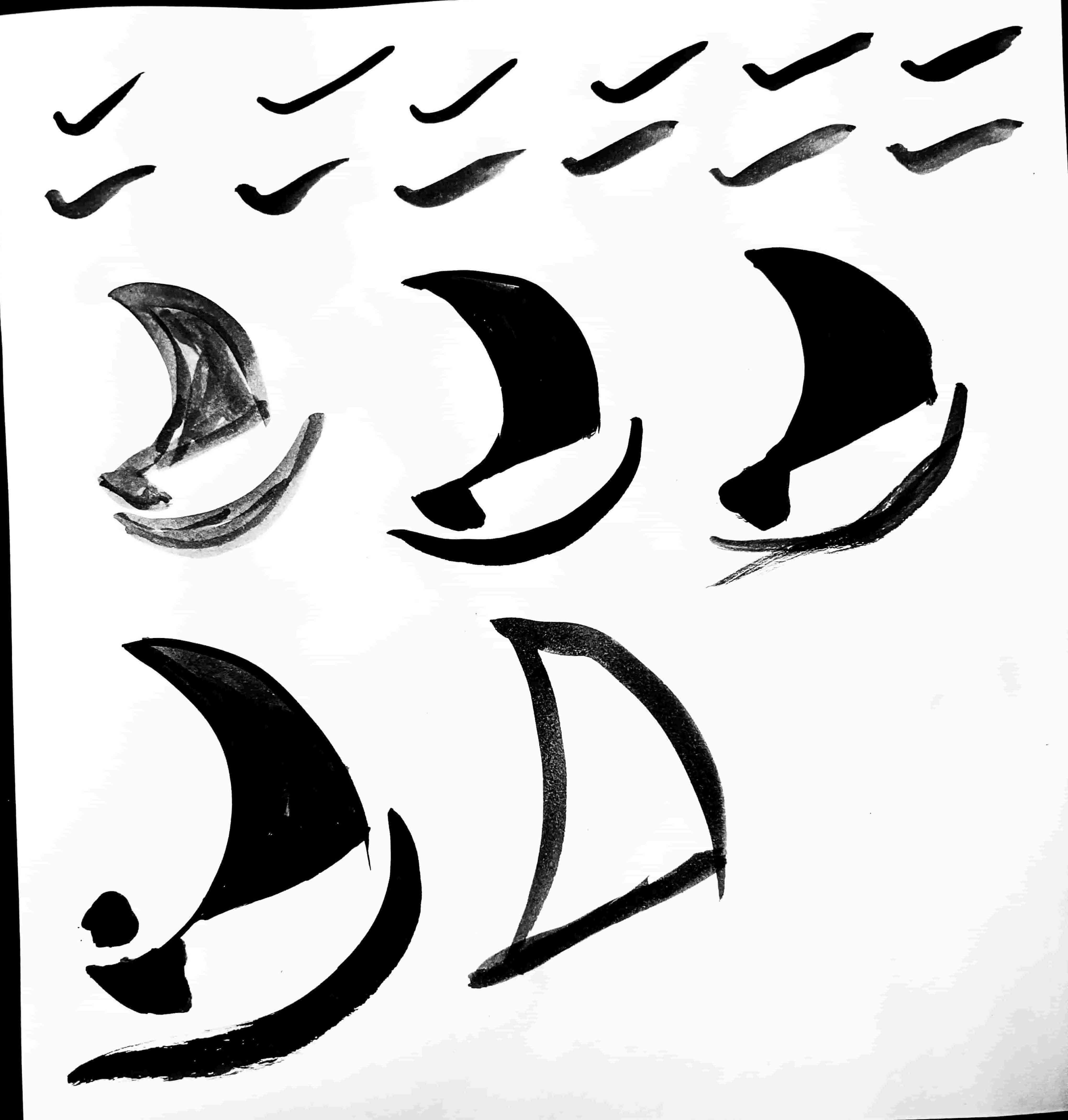
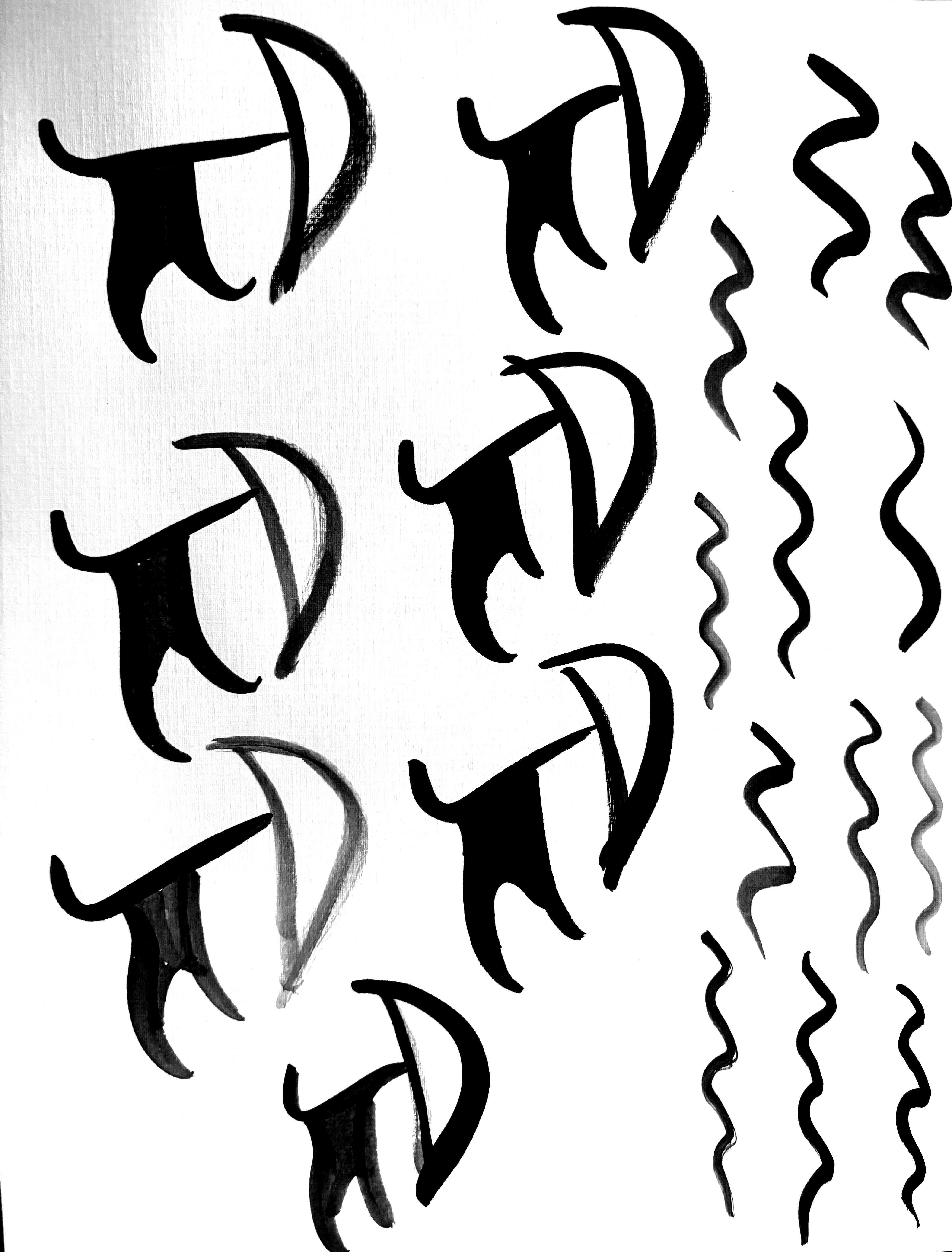
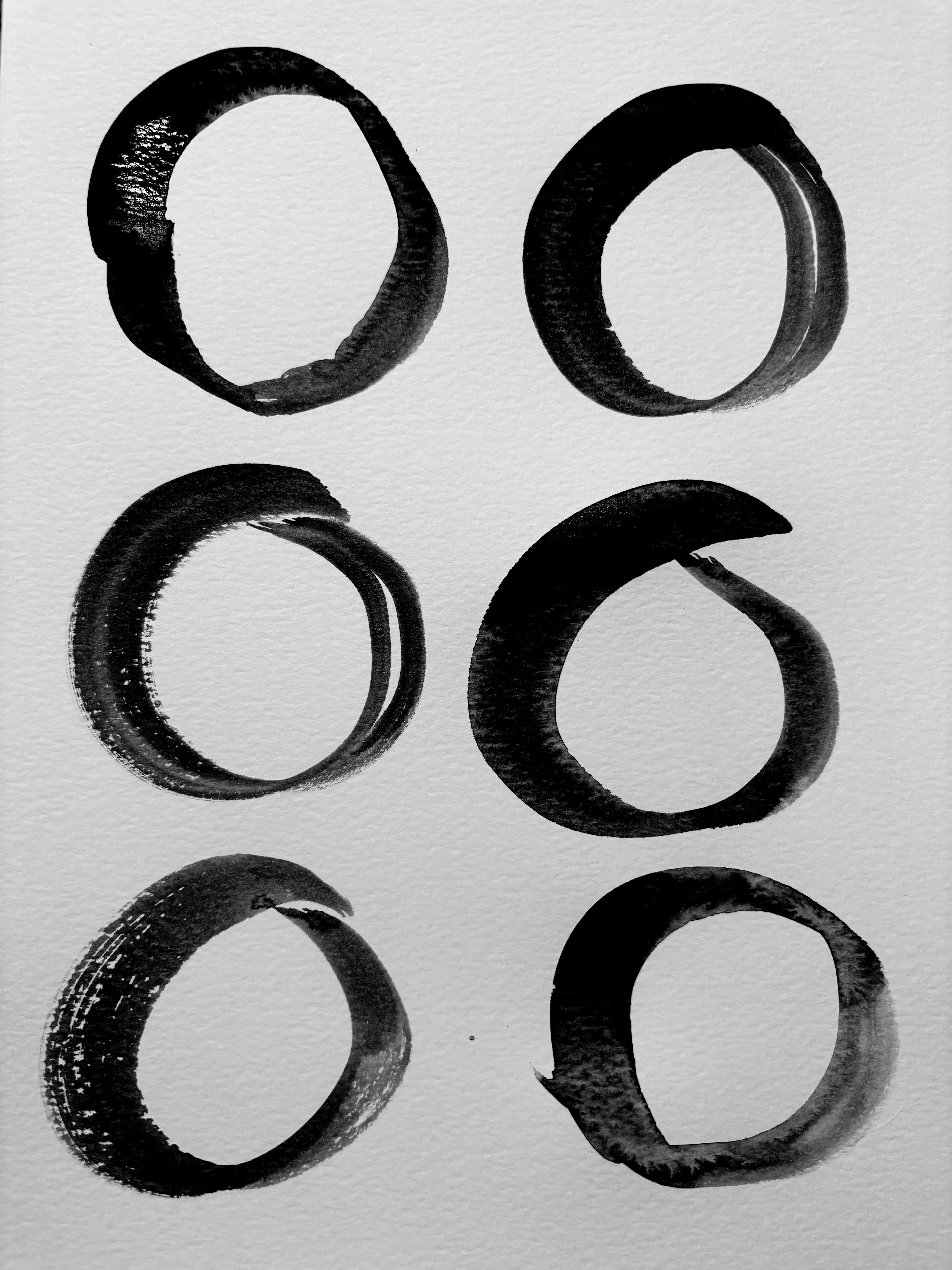
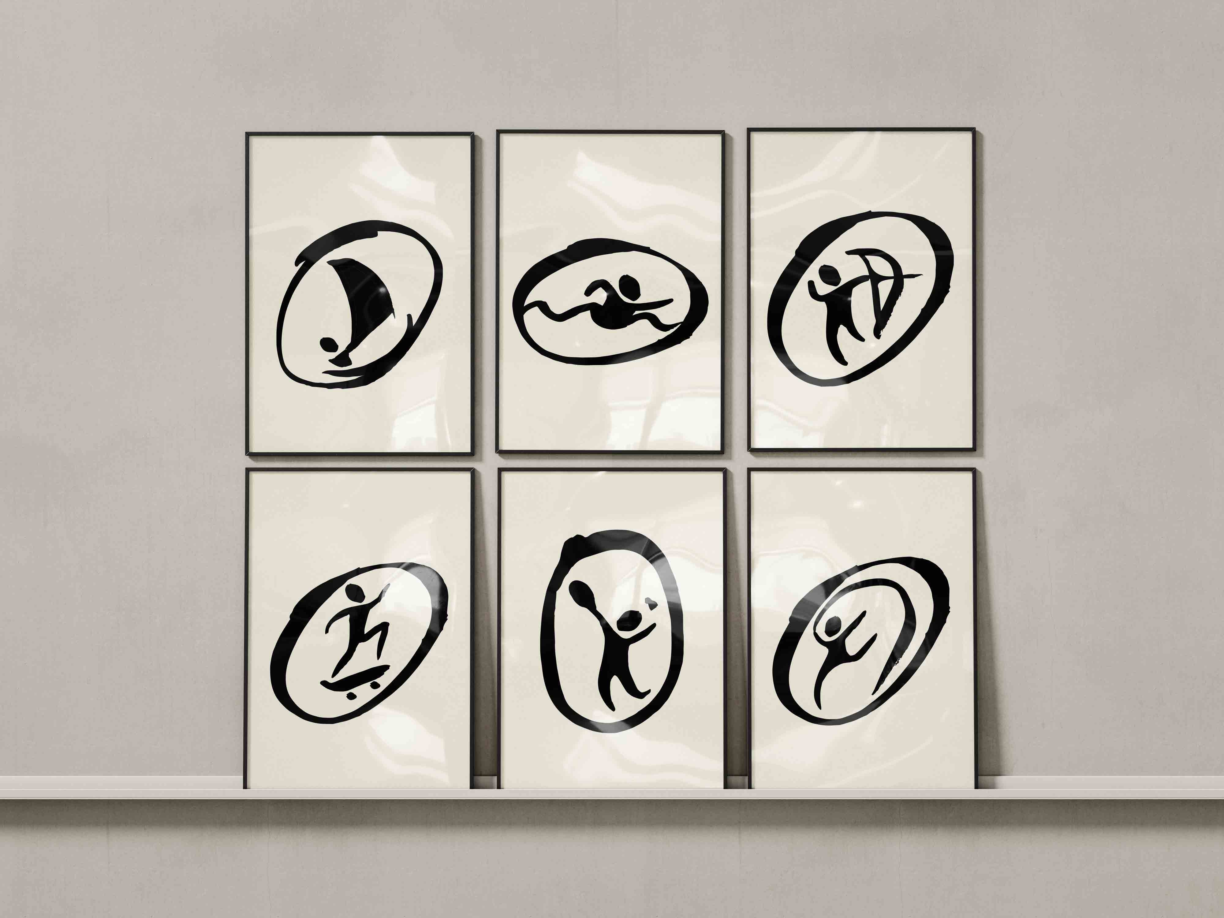
I explored the expressive potential of ink through varying line work and
shapes,
balancing simplicity with recognizability.
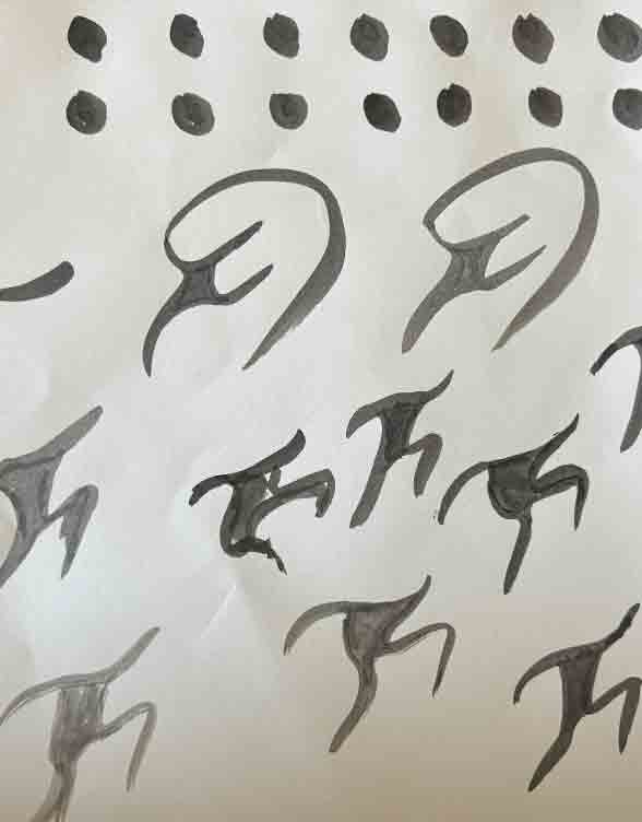
Once I had a solid form such as the head or even the body, I used both
Photoshop
and Illustrator to digitize and refine my designs. This involved tracing
the ink
drawings, cleaning up any imperfections, and adjusting proportions to
ensure
clarity and consistency across the set of pictograms.
IN STUDIO
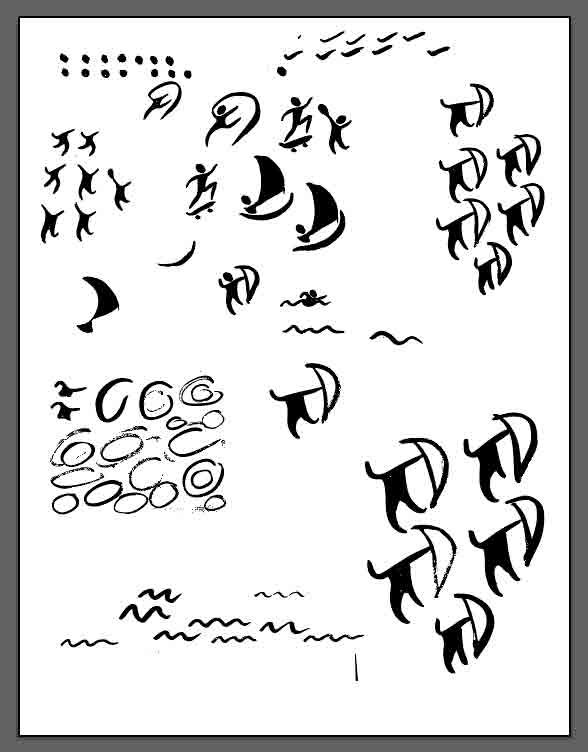
The Pictograms


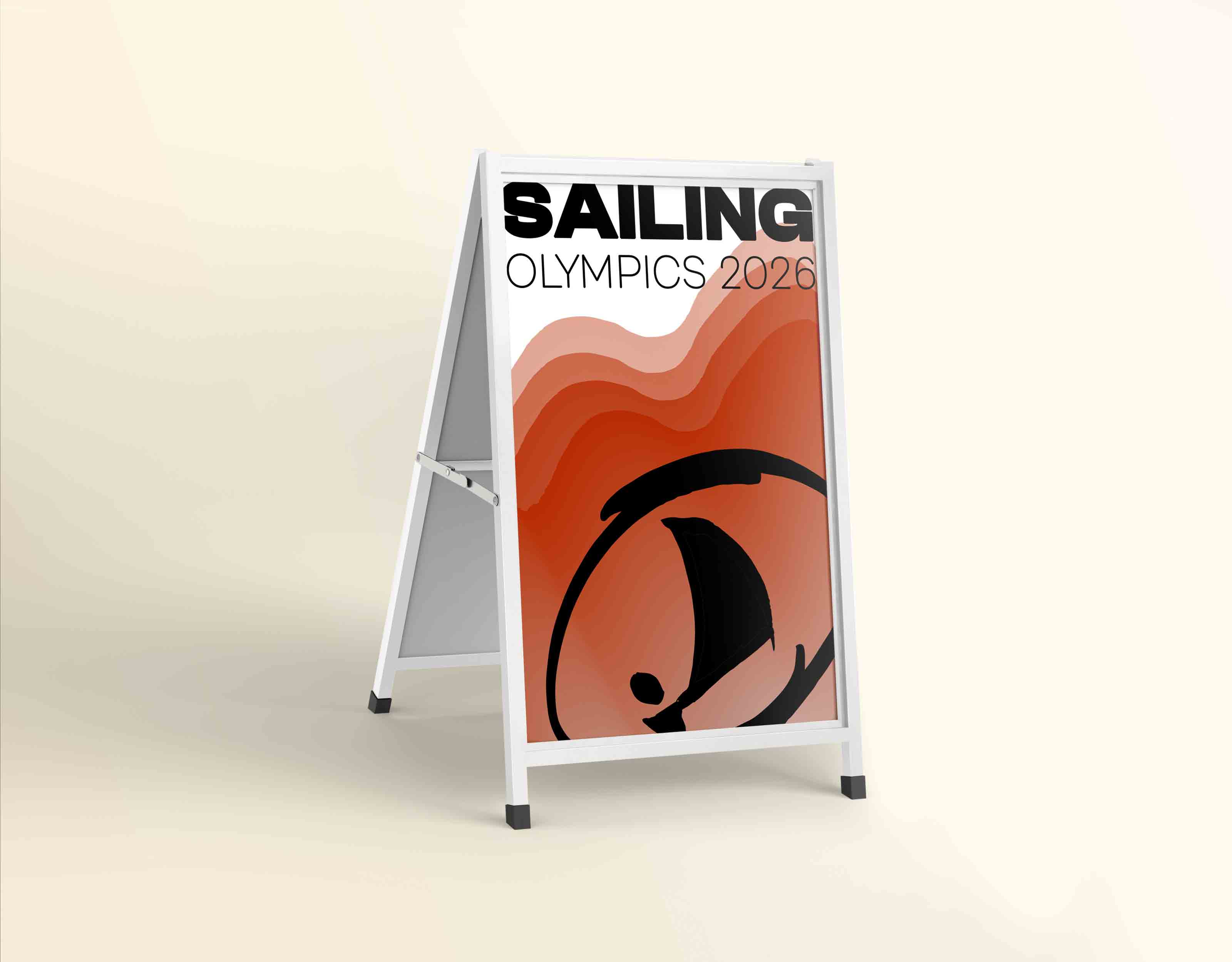
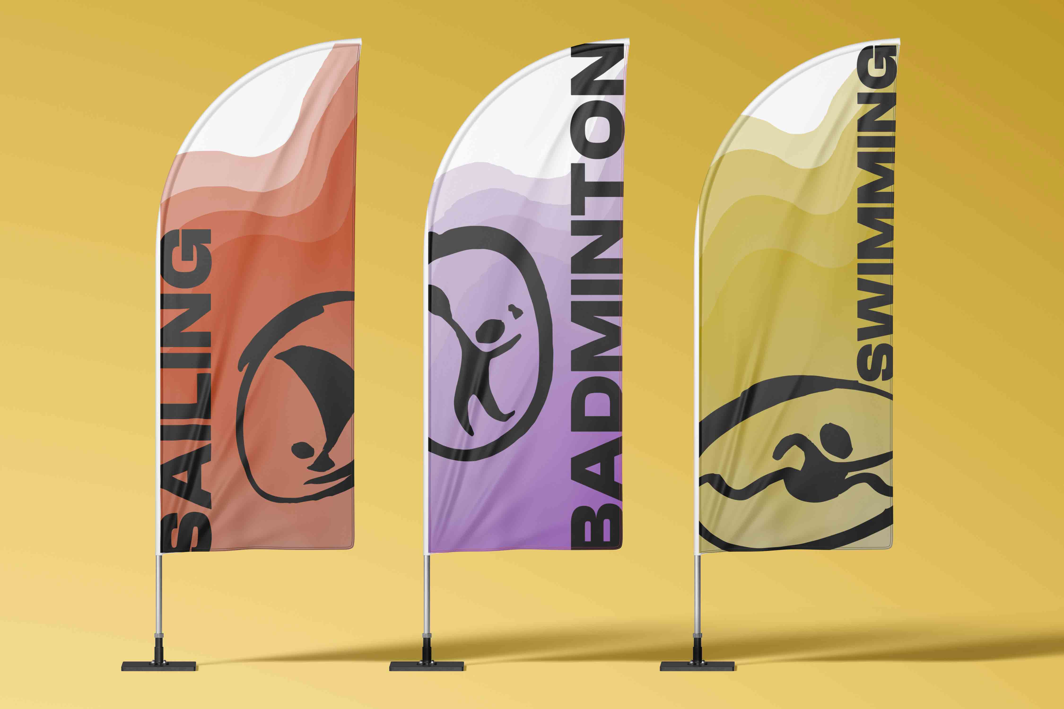
Beyond pictograms
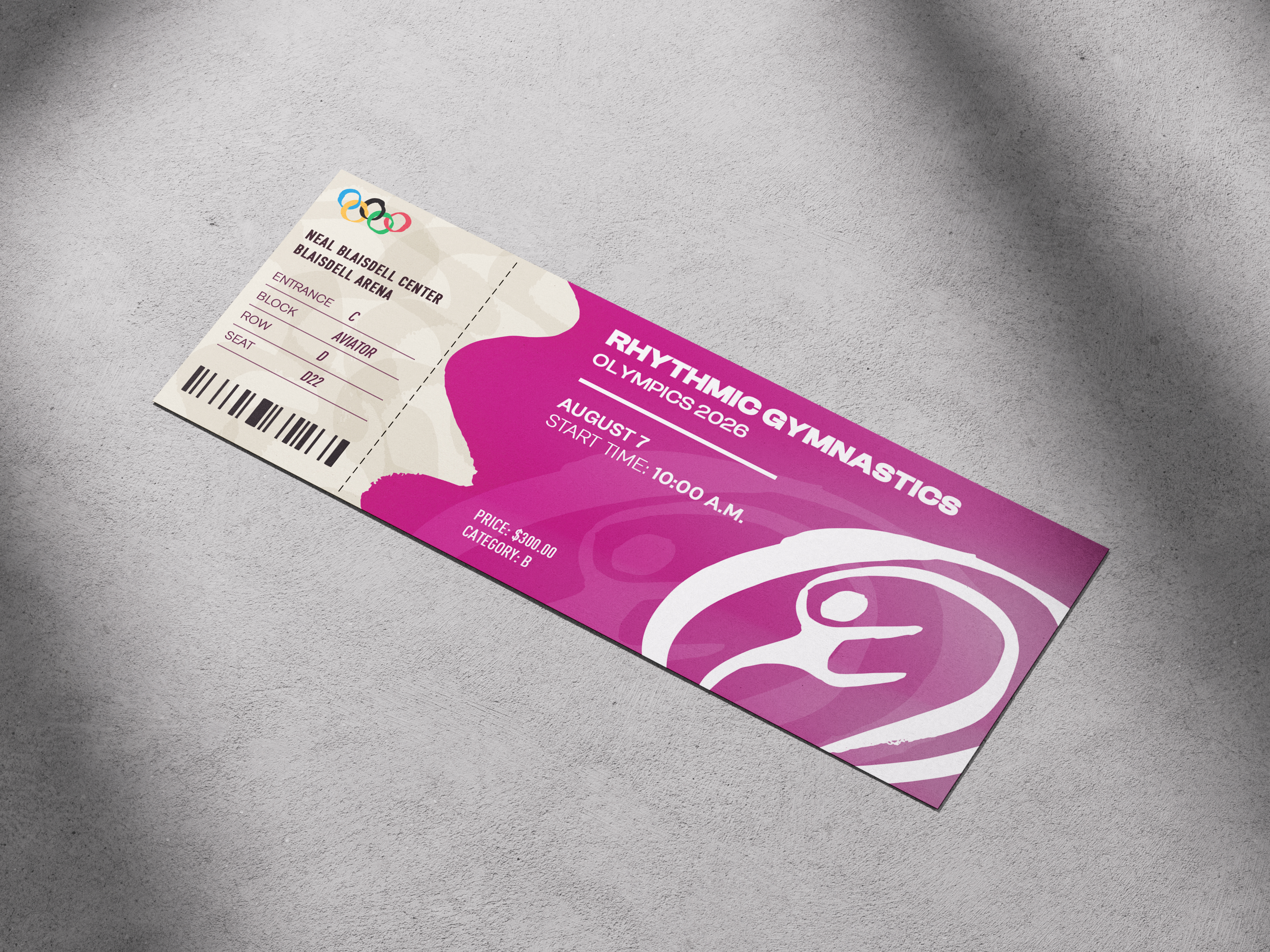
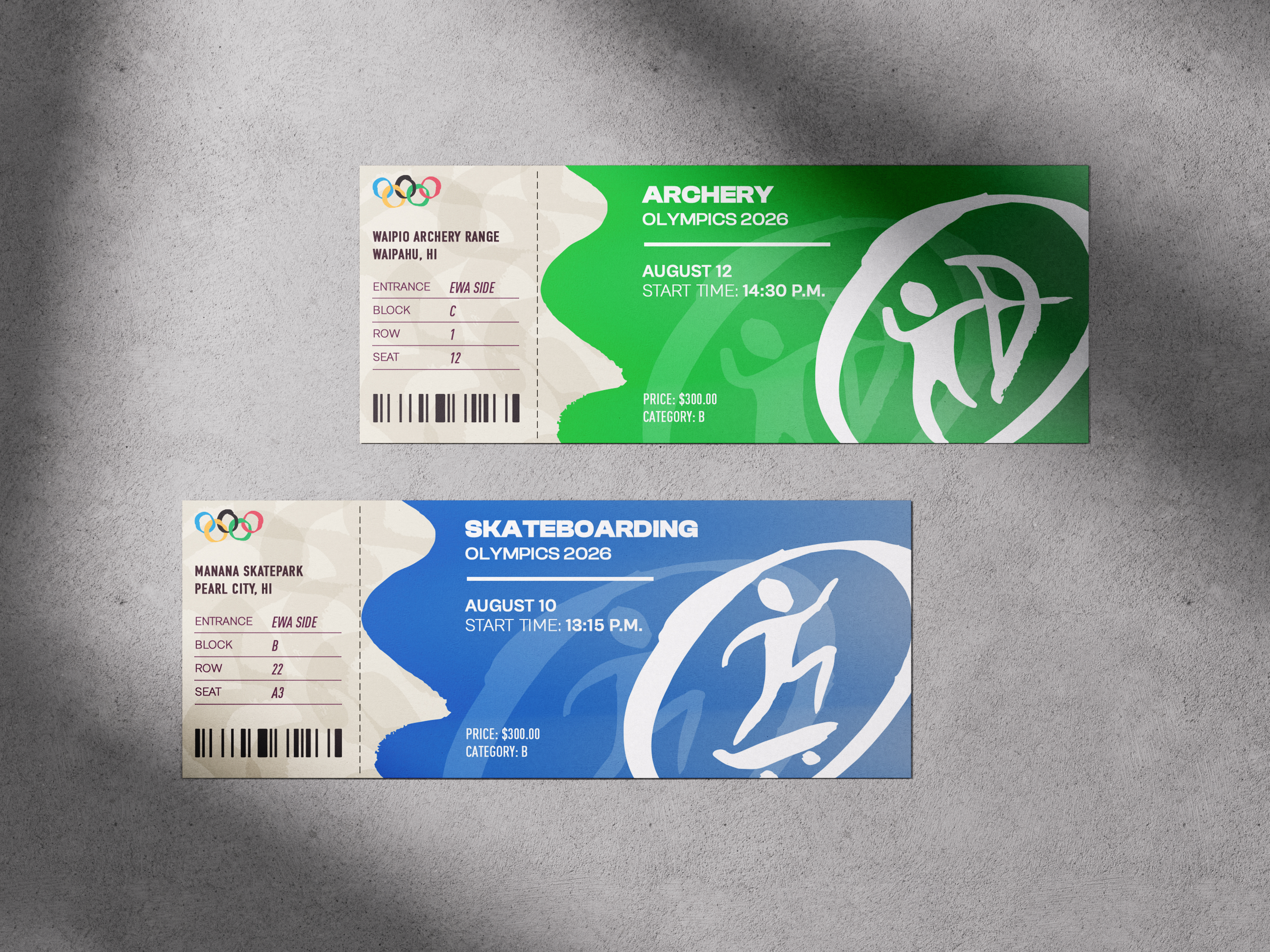
Building from the pictograms, I used those same shapes and visuals to build out the rest of the Olympic identity. What began as a functional system of symbols grew into a full visual language, helping me create an identity that feels cohesive, energetic, and easy to recognize across everything.
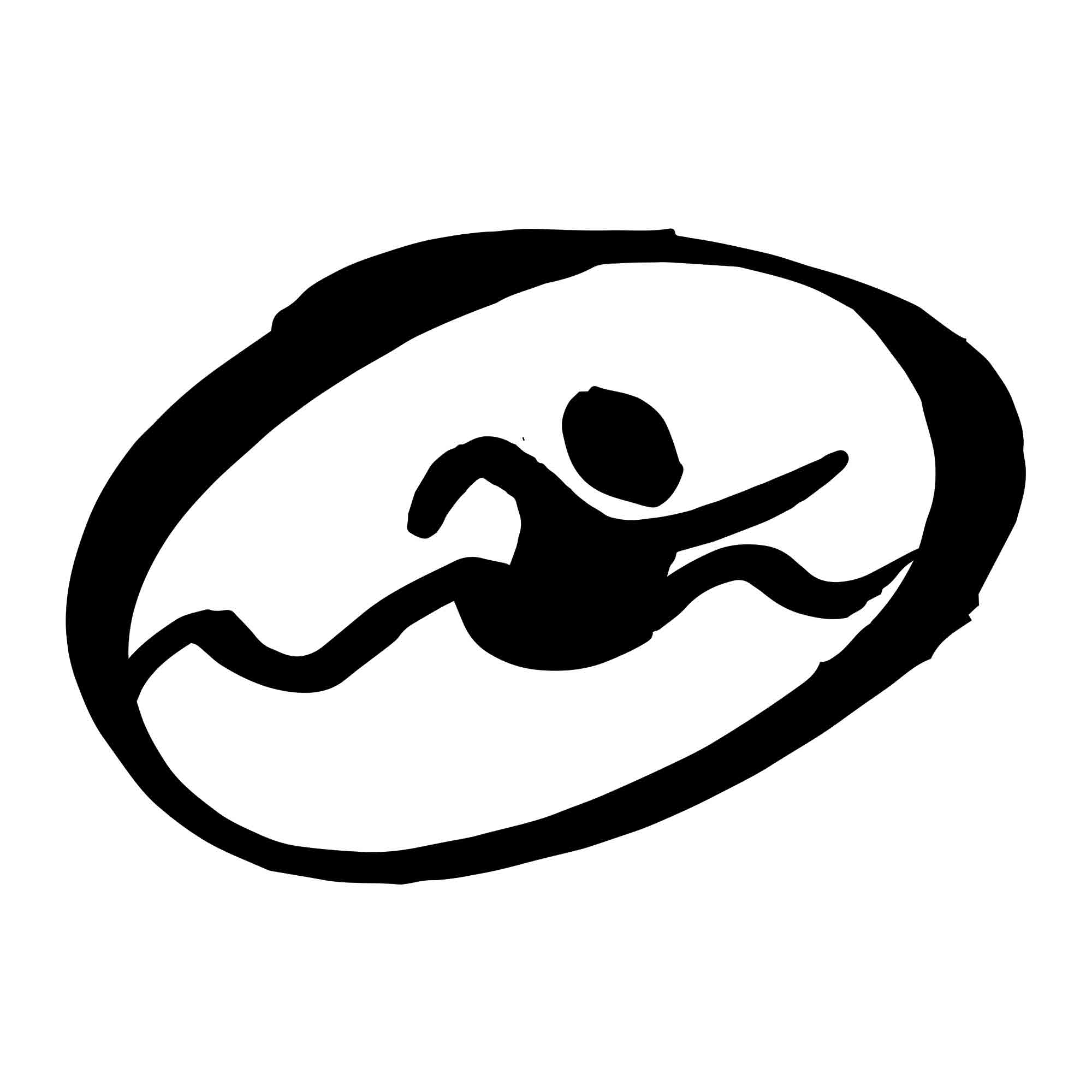
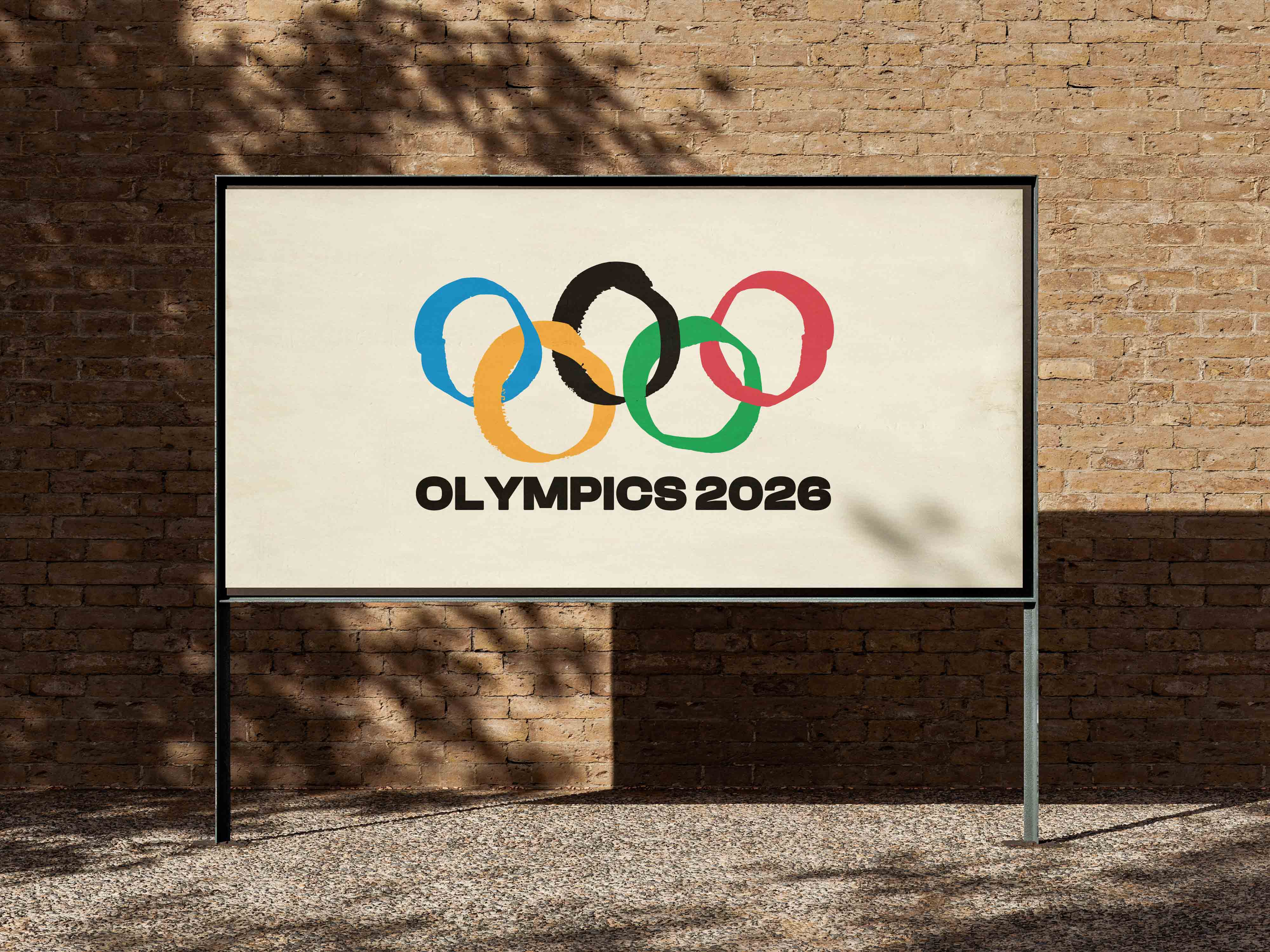
THE OLYMPIC LOGO
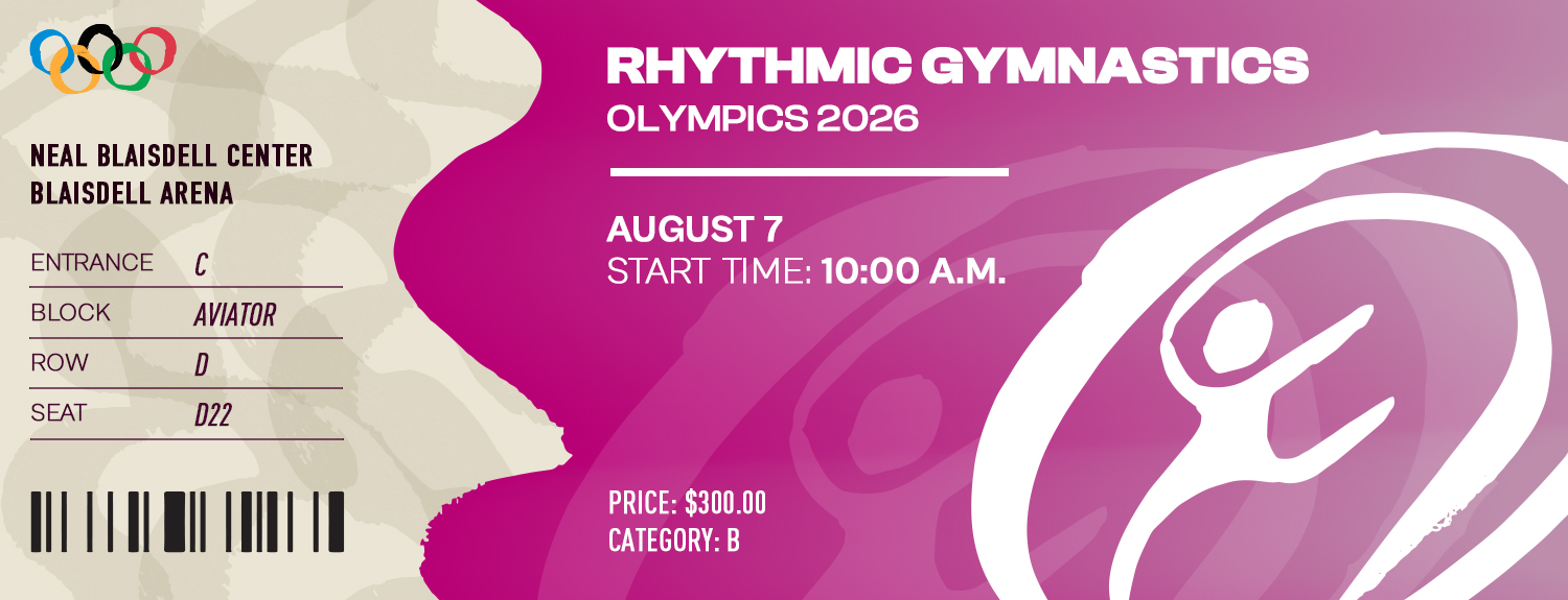
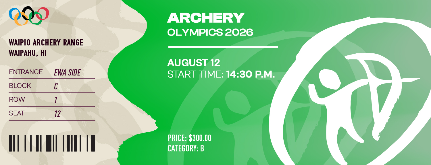
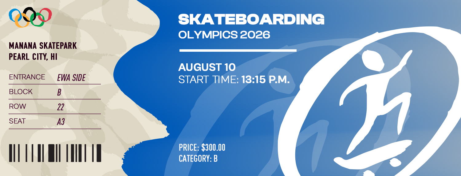
Olympic Tickets
BANNERS